
Back on February 26th 2015, Google bestowed big news on the marketing world and confirmed that on April 21st, a significant structural algorithm change would come into effect that would impact the ranking of websites based on mobile-friendliness.
While we wait with bated breath for the full impact of the algorithm update, the expectation is that sites that are not mobile-friendly will run the risk of dramatically dropping in mobile search engine rankings.
According to Google, this change is “expected to affect mobile searches in all languages and will have a significant impact on search results.” Today’s update will also make more relevant app content in search results. This means that Google will present content from indexed apps more prominently in mobile search (providing users who have the app downloaded are signed in).
The algorithm rolls out today, and while it’s safe to say we’ve been forewarned by Google, we thought we would fill you in on what it means for your website and how you can avoid getting losing traction in mobile search rankings.
Google says: Be Mobile-Friendly for a Better User-Experience
Google’s ongoing goal is to provide the best online experience for internet users.
This inherently means algorithms must evolve as our digital behaviour evolves. As more people use mobile devices, be it smartphone or tablet, algorithm patterns have to adapt to better reflect the devices used to access the internet.
Due to the growing evolution of the mobile experience, this algorithm update will expand the use of mobile-friendliness as an important ranking signal and will better accommodate the audience using mobile devices by providing relevant search results, regardless of the device users are accessing the internet from.
This mobile algorithm update means mobile-friendly websites will be taking up the prime real estate in mobile search results and if a website isn’t mobile-friendly or is a poor quality mobile site, the website will suffer. Searchers on mobile will see the websites that provide a great mobile experience for users.
Google’s Preferred Mobile Configurations for a Mobile-Friendly Site
Google’s recommended configuration for mobile-optimized sites is a responsive framework and it will give preference to this framework over a website with a separate desktop and mobile version. Mobile-friendly sites will be marked with a mobile-friendly tag in said search results increasing the likelihood that a user clicks on a result on the mobile search engine results page.
Google wants to make it easier for the people who are using mobile devices to access websites, “[w]hen it comes to search on mobile devices, users should get the most relevant and timely results, no matter if the information lives on mobile-friendly pages or apps.”
How do I know if my Website is Mobile-Friendly?
You can use Google’s mobile-friendly test to test a few pages of your site to see if the pages are mobile-friendly. If you have a website, you can simply log into your Webmaster Tools account to get a complete list of mobile usability issues across your entire website using the mobile usability report.
Want to keep Google smiling from ear-to-ear? Your best bet is to implement a responsive framework which is an intuitive and self-adjusting framework and compatible with all devices; desktop, laptop, tablet, and smartphone.
But wait, what is a Responsive Framework and why do I need one?
Smartphones, tablets and other mobile devices have inherently changed the approach to design and user-experience. Canadians are among the world’s heaviest Internet users. We rank second in the world, at 33 hours per week and a whopping 49% of it is accessed through mobile devices according to the measurement firm, comScore.
Each and every day, the number of mobile devices, platforms and browsers that need to function with your site continues to grow. As the variety of devices continues to grow, the way we access and navigate the web evolves and as designers and developers, it is our job is to implement digital solutions that allow a seamless adaptation to these new devices.
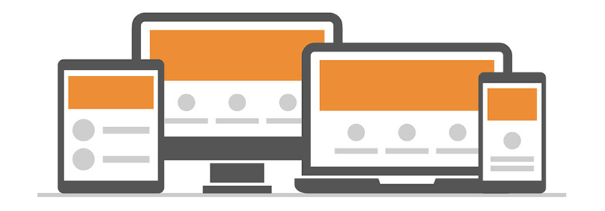
Responsive web design (RWD) is a future-friendly, mobile-friendly structure that can account for the unpredictability of the digital landscape and our modern-day love affair with multiple screen sizes and devices.
RWD is an approach to web design in which a site is crafted to provide an optimal viewing experience—easy reading and navigation with a minimum of resizing, panning, and scrolling—across a wide range of devices (from desktop computers to mobile phones). RWD’s expand fluidly to suit the size of the screen on the device you are using to provide the best user-experience. The ingenuity behind the framework is its scalability and adaptability, allowing any website to flex and adapt to the device it is being viewed on.
Responsive websites not only heighten user-experience, companies benefit from improved SEO results as well. Changes to Google’s algorithms give preference to mobile-friendly websites, which means potential customers will be more likely to find your business.
Benefits of responsive web design:
- Provides ultimate user experience: faster, smarter and more flexible
- Increased SEO value and increase your visibility in search engines
- Increase your audience reach to the tablet and mobile audiences; it’s mobile-friendly!
- Increase sales and conversion rates
- Cost effective: Save time and cost on a mobile website as there is no need to create an additional stand-alone mobile site
- RWD is a solution that provides a beautiful and easy-to-navigate site, it also ensures your audience can see your company regardless of what device they are using to access the Internet because it’s inherently mobile-friendly.
Need some help preparing for “Mobilegeddon”? Ready to go mobile-friendly? We can help answer any questions you might have.
Want to do a bit more research? Check out these great resources:
Mobilegeddon Cometh: New Google “Mobile Friendly Update” To Reward Sites Beginning April 21
Finding more mobile-friendly search results
Is Your Website Optimized For Mobile? You Have Until April 21 To Get It Done
9 Things You Need to Know About Google’s Mobile-Friendly Update
Interested in learning more? Get in touch with us today to find out how we can help!
RC Design Inc
241 Main Street South,
Newmarket, ON L3Y 3Z4
(905)898-5026